Thursday, 9 April 2015
Wednesday, 8 April 2015
Questionnaire Results
I created a questionnaire to hand out alongside a copy of my magazine in order to get audience feedback and find out what they liked and disliked about my magazine. Originally, this was the questionnaire I was handing out:

However, after I had given it to a few people, and they all asked for space to put reasons do explain their answered, I decided to change the questionnaire. Instead of having a closed questionnaire I changed it into a mix between a closed and open questionnaire, leaving a space for the audience to explain the reasons behind a Yes/No answer.
This is the questionnaire I handed out after this:


These are the results to my questionnaire:
Wednesday, 1 April 2015
Monday, 30 March 2015
Tuesday, 24 March 2015
Editing Photos
Before is an exam of the photos I have been editing on Photoshop and how they looked before and after I edited them.
Before:

After:

This is one of the photos where the editing makes the most difference and seems the most dramatic out of all the photos I have edited. I used the Auto Tone as well as thinking the tone and colour myself to create this second image. The colours of both the sea and sand are warmer and therefore more positive and creates a nicer image for the audience; helping to persuade them more.
Before:

After:

Again, I used the same types of tools on Photoshop to edit this photo. I did like the original photo but still wanted to play around with Photoshop to see if I liked the photo more after some editing; which I did. Again, I think the colour change made the photo a little warmer than it was previously.
Thursday, 19 March 2015
Tuesday, 17 March 2015
Thursday, 12 March 2015

Wednesday, 11 March 2015
Cuba Article
Over the past few days I have been writing up my Cuba article, which is a travel guide to Cuba. This has took the longest time out of all the articles to write, as it is the longest, and the most in depth. As well as this it is much more informative, than say the Disney article which is very opinionated/focus' more on my experience. Though the Cuba article does feature my experiences, I had to do a lot of research to try and find information for the guide.
The article/guide consists of the following subtitles:
- Guardalavaca
- Havana
- Varadero
- Santagio de Cuba
- Travelling around Cuba
- Top 10 Things To Do in Cuba
The article/guide consists of the following subtitles:
- Guardalavaca
- Havana
- Varadero
- Santagio de Cuba
- Travelling around Cuba
- Top 10 Things To Do in Cuba
Thursday, 5 March 2015
Abstract/Intro
Today I started writing the 'write up' part of my project, starting with the abstract and introduction.This is what I have got so far.

Monday, 16 February 2015
Photos
I've had some problems lately with my photos I had picked to use in my magazine; where they all got deleted, so I have had to spend some time sorted through photos and trying to find the ones I want to use. These are some of the photos I am using for my articles:


Wednesday, 11 February 2015
Slogan
I've spent some time researching different travel quotes and phrases that I could use for the slogan/catch phrase of my magazine as well as tips on creating a slogan.
I found some tips on how to create a catchy slogan :
Some ideas I have had:
I found some tips on how to create a catchy slogan :
Guidelines To Create Great Slogan
- Identification. A good slogan must stay consistent with the brand name either obviously stated or strongly implied. It’s better to include the name of your business to it.
- Memorable. Some of the best taglines or slogans are still being used today, even though they were launched several years ago.
- Beneficial. Reveal your purpose and benefits of the product by conveying the message in consumer language. Turn bad into good. Suggest the risk of not using the product. Create a positive feeling for the consumers.
- Differentiation. In an overcrowded market, companies on the same industry need to set themselves apart thru their creative and original tagline or slogan.
- Keep it simple. Use proven words and short keywords. One word is usually not enough.
Some ideas I have had:
- To travel is to take a journey.
- Travel: a permanent change in the ideas of living.
- We travel for fulfilment.
- To travel is to take a journey into yourself.
Thursday, 5 February 2015
Magazine Cover Part 4
This is what I have done today:

- I have added the rest of the storylines to each side, adding some into boxes, some in different colours, one with a photo alongside it and some just text alone. This makes it more interesting.
- I have changed the shade of blue used, after discussing it with my peers, which I think matches the colour of the image much better as well.
- I have added a Bevel and Emboss/Contour effect onto the circle/competition to make it have more of a 3D effect and stand out, off the photo.
- I need to think of a slogan to feature along the banner at the bottom, but if not I will use this as another way to display a storyline.
Changing Colour Scheme
After realising I want to change the colour scheme/ the shade of blue I have been messing around with shades and colours to find a one I liked. I also asked my peers what they liked best. These were the two options.

We all agreed that we liked the second shade of blue better than the original one I was using. I have changed this on my cover as well and also like this.
Monday, 2 February 2015
Contents Page Part 3
Changes I have made today to the contents page:

- As you can see I have added in the descriptions in to the storylines in the Features section; this gives the reader a hint of what to expect with the article.
- I have also added two photos along with page numbers to direct to other articles. This is more interesting and fun then just using text.
Some of the photos I used I have edited on Photoshop to make them brighter and have made a separate post to show the before and after differences between these photos.
Saturday, 31 January 2015
Editing Photos
Below are some examples of how I have been editing the photos. Mostly I have been editing the Brightness/Contrast in order to make it more clearer/brighter. You can see this clearly in the photo of the beach in Cuba.
Before:

After:

Before:
After:

Thursday, 29 January 2015
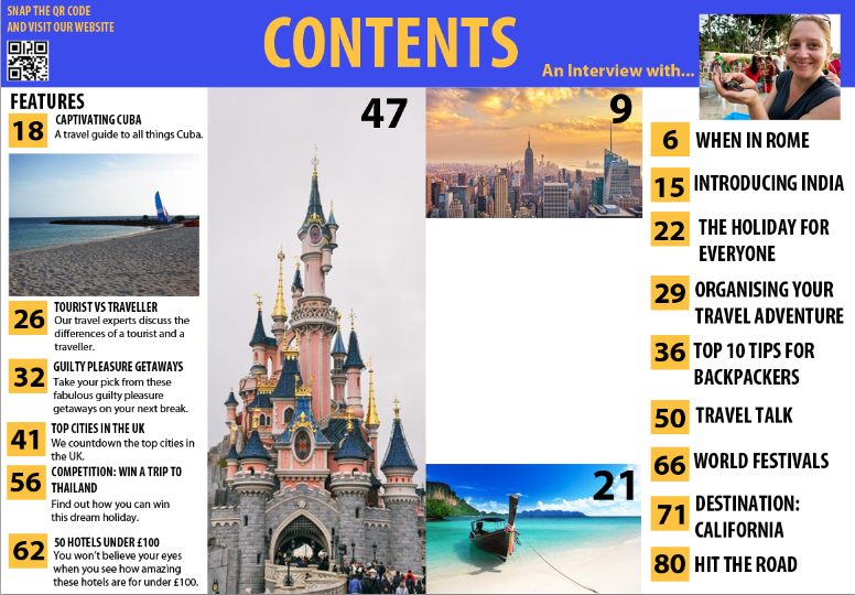
Contents Page Part 2
This is the process of my content page from working on it today.

- As you can see I've started added the front cover storylines to my features column. I have added the title, but have left room for a description underneath which I will have to add in.
- I have started adding page numbers, I like the idea of the yellow box as it adds to the colour scheme and acts as a bullet point, which makes it stand out and clear to read. I also liked the idea of it being larger than the font to make it stand out and easy for the reader to navigate around the magazine.
- I have changed the font due to issues when trying to edit the previous font and have also changed the position, moving it to the centre of the page. I think this makes it clearer and also gives me room to add something else on the left.

- Here I have added the large image I wanted in this space. It is a photo of the Disneyland Paris castle as one of my articles are on Disneyland Paris. In the top right hand corner I have added the page number.
- I have also changed the font of the title to the font that I have been using as the font throughout the magazine because I still didn't like the fancy, curvy font I have used on the cover. I like this much better and it still fits as it matches the other text.
- I have also added a QR code and a little message that says 'snap the QR code and visit our website.' This is often featured in magazines and means a smartphone user can quickly and easily get to the magazine's website if they want to.

- The other storylines have started to be added on the second page of the contents along with the page numbers. At the minute I don't want to include a description with these storylines, like on the features side, however, this may change as I continue working on my contents page.
Thursday, 22 January 2015
Magazine Cover Part 3
Only a few things have changed since the last update:

- After getting permission to use Stephanie's photos I have chose this one to use as the background of the cover. I think the colours of the picture fit in well with the colour scheme of the magazine. I may use the eyedropper to pick up certain colours from the sky/sea to make the colours match a bit more but at the minute I haven't found a colour I have liked by doing this; though I do want to change the shade of blue used.
- I have also changed the masthead font. At the minute I think I am keeping this one, because when I have been messing around with my contents the font is not working on their: when I am attempting to change the colour/add effects and just edit it in general it is not working. The font is going blurry, especially when I am trying to fill it in (colour) due to the curvy shape, and won't work as well as it is on the cover.I have changed it to this one to see if this works any better.
Tuesday, 20 January 2015
Interview Part 1
Today I started working on my interview article in InDesign. This is what I have done so far.


- As you can see; I've started off with making 6 pages, as so far, this is how long I think the article will be; including leaving room for images.
- I have added columns in and then added the interview into the columns.
- I have started to create a title page: adding the title and some images I think I may use; however this is just a draft/layout and I will need to change the font etc.
- I have also started adding a few pictures to other pages; these pages may not be the final images I use, however, they are just showing the layout and spacing at the minute.
- I think I will separate some of the article so that the text will wrap around some images as well as including some large quotes in the middle of the text.
- I also may need to add more to the interview; if this is the case I will contact Stephanie with some more questions for her to answer.
- I have started adding the page number etc. to the bottom of the page; this helps keep a house style throughout the magazine.
Thursday, 15 January 2015
Photos Permission
After realising I would need photos to go alongside the interview for my magazine I emailed Stephanie asking for her permission to use photos from her blog.

She replied back and said it was fine to use her photos so I have been looking through her blog today finding photos that I think would suit the magazine and the interview. These are some of the photos I have saved and are thinking about using in the magazine.


She replied back and said it was fine to use her photos so I have been looking through her blog today finding photos that I think would suit the magazine and the interview. These are some of the photos I have saved and are thinking about using in the magazine.
Subscribe to:
Comments (Atom)