Monday, 16 February 2015
Photos
I've had some problems lately with my photos I had picked to use in my magazine; where they all got deleted, so I have had to spend some time sorted through photos and trying to find the ones I want to use. These are some of the photos I am using for my articles:

Wednesday, 11 February 2015
Slogan
I've spent some time researching different travel quotes and phrases that I could use for the slogan/catch phrase of my magazine as well as tips on creating a slogan.
I found some tips on how to create a catchy slogan :
Some ideas I have had:
I found some tips on how to create a catchy slogan :
Guidelines To Create Great Slogan
- Identification. A good slogan must stay consistent with the brand name either obviously stated or strongly implied. It’s better to include the name of your business to it.
- Memorable. Some of the best taglines or slogans are still being used today, even though they were launched several years ago.
- Beneficial. Reveal your purpose and benefits of the product by conveying the message in consumer language. Turn bad into good. Suggest the risk of not using the product. Create a positive feeling for the consumers.
- Differentiation. In an overcrowded market, companies on the same industry need to set themselves apart thru their creative and original tagline or slogan.
- Keep it simple. Use proven words and short keywords. One word is usually not enough.
Some ideas I have had:
- To travel is to take a journey.
- Travel: a permanent change in the ideas of living.
- We travel for fulfilment.
- To travel is to take a journey into yourself.
Thursday, 5 February 2015
Magazine Cover Part 4
This is what I have done today:
- I have added the rest of the storylines to each side, adding some into boxes, some in different colours, one with a photo alongside it and some just text alone. This makes it more interesting.
- I have changed the shade of blue used, after discussing it with my peers, which I think matches the colour of the image much better as well.
- I have added a Bevel and Emboss/Contour effect onto the circle/competition to make it have more of a 3D effect and stand out, off the photo.
- I need to think of a slogan to feature along the banner at the bottom, but if not I will use this as another way to display a storyline.
Changing Colour Scheme
After realising I want to change the colour scheme/ the shade of blue I have been messing around with shades and colours to find a one I liked. I also asked my peers what they liked best. These were the two options.
We all agreed that we liked the second shade of blue better than the original one I was using. I have changed this on my cover as well and also like this.
Monday, 2 February 2015
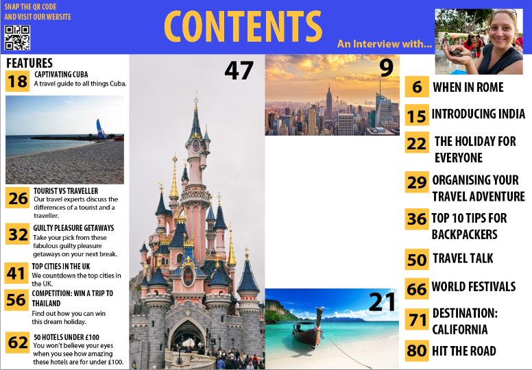
Contents Page Part 3
Changes I have made today to the contents page:
- As you can see I have added in the descriptions in to the storylines in the Features section; this gives the reader a hint of what to expect with the article.
- I have also added two photos along with page numbers to direct to other articles. This is more interesting and fun then just using text.
Some of the photos I used I have edited on Photoshop to make them brighter and have made a separate post to show the before and after differences between these photos.
Saturday, 31 January 2015
Editing Photos
Below are some examples of how I have been editing the photos. Mostly I have been editing the Brightness/Contrast in order to make it more clearer/brighter. You can see this clearly in the photo of the beach in Cuba.
Before:
After:
Before:
After:
Thursday, 29 January 2015
Contents Page Part 2
This is the process of my content page from working on it today.
- As you can see I've started added the front cover storylines to my features column. I have added the title, but have left room for a description underneath which I will have to add in.
- I have started adding page numbers, I like the idea of the yellow box as it adds to the colour scheme and acts as a bullet point, which makes it stand out and clear to read. I also liked the idea of it being larger than the font to make it stand out and easy for the reader to navigate around the magazine.
- I have changed the font due to issues when trying to edit the previous font and have also changed the position, moving it to the centre of the page. I think this makes it clearer and also gives me room to add something else on the left.
- Here I have added the large image I wanted in this space. It is a photo of the Disneyland Paris castle as one of my articles are on Disneyland Paris. In the top right hand corner I have added the page number.
- I have also changed the font of the title to the font that I have been using as the font throughout the magazine because I still didn't like the fancy, curvy font I have used on the cover. I like this much better and it still fits as it matches the other text.
- I have also added a QR code and a little message that says 'snap the QR code and visit our website.' This is often featured in magazines and means a smartphone user can quickly and easily get to the magazine's website if they want to.
- The other storylines have started to be added on the second page of the contents along with the page numbers. At the minute I don't want to include a description with these storylines, like on the features side, however, this may change as I continue working on my contents page.
Subscribe to:
Posts (Atom)