Saturday, 31 January 2015

Editing Photos

Below are some examples of how I have been editing the photos. Mostly I have been editing the Brightness/Contrast in order to make it more clearer/brighter. You can see this clearly in the photo of the beach in Cuba.
 
Before:
 
After:


Before:
 
After:
 

Thursday, 29 January 2015

Contents Page Part 2

This is the process of my content page from working on it today.

  • As you can see I've started added the front cover storylines to my features column. I have added the title, but have left room for a description underneath which I will have to add in.
  • I have started adding page numbers, I like the idea of the yellow box as it adds to the colour scheme and acts as a bullet point, which makes it stand out and clear to read. I also liked the idea of it being larger than the font to make it stand out and easy for the reader to navigate around the magazine.
  • I have changed the font due to issues when trying to edit the previous font and have also changed the position, moving it to the centre of the page. I think this makes it clearer and also gives me room to add something else on the left.
                           

  •  Here I have added the large image I wanted in this space. It is a photo of the Disneyland Paris castle as one of my articles are on Disneyland Paris. In the top right hand corner I have added the page number.
  • I have also changed the font of the title to the font that I have been using as the font throughout the magazine because I still didn't like the fancy, curvy font I have used on the cover. I like this much better and it still fits as it matches the other text.
  • I have also added a QR code and a little message that says 'snap the QR code and visit our website.' This is often featured in magazines and means a smartphone user can quickly and easily get to the magazine's website if they want to.

 
  • The other storylines have started to be added on the second page of the contents along with the page numbers. At the minute I don't want to include a description with these storylines, like on the features side, however, this may change as I continue working on my contents page.

Thursday, 22 January 2015

Magazine Cover Part 3

Only a few things have changed since the last update:
 
 
  • After getting permission to use Stephanie's photos I have chose this one to use as the background of the cover. I think the colours of the picture fit in well with the colour scheme of the magazine. I may use the eyedropper to pick up certain colours from the sky/sea to make the colours match a bit more but at the minute I haven't found a colour I have liked by doing this; though I do want to change the shade of blue used.
  • I have also changed the masthead font. At the minute I think I am keeping this one, because when I have been messing around with my contents the font is not working on their: when I am attempting to change the colour/add effects and just edit it in general it is not working. The font is going blurry, especially when I am trying to fill it in (colour) due to the curvy shape, and won't work as well as it is on the cover.I have changed it to this one to see if this works any better.

Tuesday, 20 January 2015

Interview Part 1

Today I started working on my interview article in InDesign. This is what I have done so far.


  • As you can see; I've started off with making 6 pages, as so far, this is how long I think the article will be; including leaving room for images.
  • I have added columns in and then added the interview into the columns.
  • I have started to create a title page: adding the title and some images I think I may use; however this is just a draft/layout and I will need to change the font etc.
  • I have also started adding a few pictures to other pages; these pages may not be the final images I use, however, they are just showing the layout and spacing at the minute.
  • I think I will separate some of the article so that the text will wrap around some images as well as including some large quotes in the middle of the text.
  • I also may need to add more to the interview; if this is the case I will contact Stephanie with some more questions for her to answer.
  • I have started adding the page number etc. to the bottom of the page; this helps keep a house style throughout the magazine.

Thursday, 15 January 2015

Photos Permission

After realising I would need photos to go alongside the interview for my magazine I emailed Stephanie asking for her permission to use photos from her blog.


She replied back and said it was fine to use her photos so I have been looking through her blog today finding photos that I think would suit the magazine and the interview. These are some of the photos I have saved and are thinking about using in the magazine.


Magazine Cover Part 2

Today I spent some time working on the cover of my magazine.
 

  • I've added an image to the background as I want to use an image to fill the full page, however I won't be using this image. I am emailing Stephanie Yoder and seeing if I can have permission to use some of her photos to go alongside the magazine, and therefore maybe one for the cover as her interview is the main storyline on the cover.
  • I have made the main storyline, the interview, stand out by adding a drop shadow to the text to give is a slight outline.
  • A barcode has been added. This may be moved to be near the price or the price may be moved to be next to the barcode as they are typically found together on a magazine, however, not always.
  • Also, I have started adding some storylines at the sides. I have been playing around with using black text, with less yellow and blue so it isn't too much.

  • As you can see here, I have also added a drop shadow and an inner shadow to the masthead to make it stand out.

Wednesday, 14 January 2015

Contents Page Part 1

This is how I have started my contents page.


  • I have made the layout the way I have imagined it so far; a double page spread; 1st column will be all the features that have been mentioned on the cover, including images to go alongside some of the storylines. The second column will be a full length image that will act as a storyline but with no words. The last column is still a bit of a guessing game. It will feature the rest of the storylines, and images to go alongside them, however, I am just going to go along with this side and see what looks best when I am doing it. I don't have any plans so far.
  • I like the idea of the main interview being separate to the others, located in the banner at the top. I saw a similar layout in one of the contents pages I analysed for my research and really liked it.
  • I wanted to keep the font of the masthead on the font page and the contents title the same, to help keep a house style throughout. However, I don't like this font for the contents title, so, I will either have to use another title for both (I haven't tried my 2nd choice of font yet with this) or use another font for the contents title. I will be choosing another font, if not two,  to act as the magazine's font for the rest of the text so I might be able to use this. 

Monday, 12 January 2015

Cover Images

I know that for the main image on the cover, I want a image that will take up the full page; most likely a destination image, however, I am not sure what image will work best. When I have done work like this in Media I would typically use a photo from the main aspect; which is common in magazine covers. In this case I would use a photo of Stephanie from the cover, as her interview is the main feature of the magazine cover. However, I can't take photos of Stephanie for my cover so I will have to substitute it for something else.

Since the magazine is a travel magazine I do think a destination photo will work best but I am not sure which one to use. Here are some of the photos that I have been trying out to use:

Thursday, 8 January 2015

Magazine Cover Part 1

This is some of the ideas I have had for my cover so far.
 
    • The title will be the largest text; stretching across the top of the magazine.
    • The main article; the interview, will feature in the middle of the magazine.
    • The blue box at the bottom of the page will feature the magazine's slogan, or will act as another place to add a storyline (and then maybe page number.)
    • The other storylines are justified to the side; some in boxes, some just text on their own and some featuring images. This will keep a variation between them all.
    • The circle, will stand out from the other shapes, and feature a competition.
    • As well as this I will need to add the magazines website, issue date/number etc. which will most likely be placed under the masthead.
    • I am not sure what image I will use for a background image at the minute and will make a separate blog post about that.

Masthead Fonts Part 2

Today I asked my peers to 'vote' for what font they liked the best out of the ones I chose. Due to their choices I have now narrowed it down to two choices. I will be switching between these two fonts when I start to make my magazine until I decide which one I like best, or which one suits the magazine best. The two fonts are shown below:

Wednesday, 7 January 2015

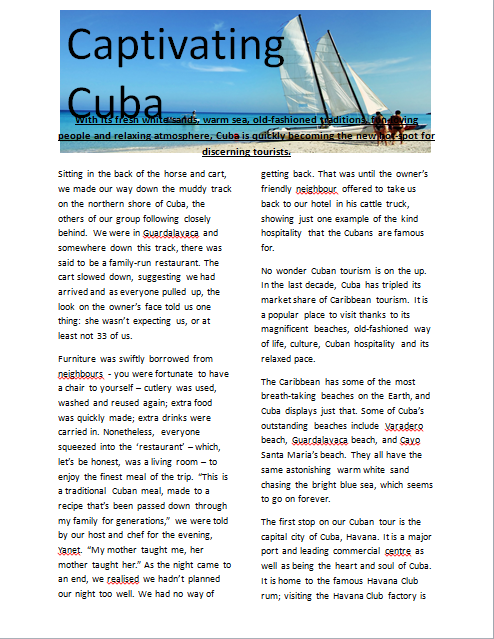
Captivating Cuba

For my AS English Coursework I wrote a travel article on Cuba that is posted below:


For my magazine, I have decided to use some of the ideas from this article; talking about the same places. However I am going to set it out in the style of a travel guide where I will have a section of my magazine about Cuba and then a different section or page on each place I have visited here. 
 

Tuesday, 6 January 2015

Software I Will Be Using

There will be two main types of software I will be using to make my magazine. These are Adobe Photoshop and Adobe InDesign.


Photoshop
 
I will be using Photoshop to:
  • edit any photos for the magazine.
  • create my magazine cover.
  • create my contents page.
InDesign

I will be using InDesign to:
  • create any of my articles
I am using InDesign for my articles as through using both programmes in my Media Studies lessons, I have found that InDesign is much better and much easier to use to create articles. You can do some things that are useful for articles that you can't do in Photoshop. For example one of these things is making the text fit around an image or a quote. This is a typical convention of an article and looks good, but it is very tricky to do in Photoshop as there is not a feature to make this happen like there is in InDesign. I will be using Photoshop for my cover and contents pages as it is better than InDesign for these. There is many more features in Photoshop than InDesign to help create a good layout, and overall contents and cover pages. I will also be using Photoshop to edit all photos, even photos that I will be using in my articles as there is many more features to make the photos perfect; whether that is through using a lighting effect or a blemish tool.

Sunday, 4 January 2015

Masthead Fonts

Below there are some examples of the fonts I am looking to use for the masthead of my magazine's front cover. All the fonts are from 1001freefonts.com


Saturday, 3 January 2015

Photos

These are some of the photos I've sorted through and selected that can be useful for my articles. All these photos are mine and have been taken by me when visiting different places.